|
Fonts for Early Music For the last several years, beginning with the editing of A Performer’s Guide to Medieval Music(Indiana, 2000) during the late 1990s, I have been creating fonts for early music, both for use in text discussions and in actual editions. My interest in early notation fonts began in the mid-70s, when I convinced Leland C. Smith to create an early music “package” for his Score program when it was still running on a mainframe computer at Stanford University. Using that system, I created Forty-Five Dufay Chansons from Canonici 213: An Edition in Original Notation (Ogni Sorte, 1983), which was honored with the Noah Greenberg Award from the American Musicological Society for work of benefit to both scholars and performers. The fonts I have created have been purchased by music publishing houses for use in making editions, mostly for notation discussions, ornaments, and incipits, although many of the fonts have been designed for use in actual editions using Finale. As can be seen in the few samples given below, I believe the symbols are the finest available for these types of notations, and look forward to adding new old fonts as I have the time and the need. They work best on Macintosh computers, which is to say, I designed the keystrokes for a Mac keyboard, but they can be made to work on PCs as well, as several users can attest. This is never going to be a huge commercial enterprise, but it takes a lot of work to design a font and I ask $50 for each font purchase, along with a request that the font not be passed along to further users. The fonts are briefly described below. Clicking on the sample character will link to a pdf keycaps file for that font. |
|
|
|
|
|
Saint Gall was designed in 2018 to render the neumes of Saint Gall chant notation, based on Saint Gall MSS 359 and 339. These are among the earliest surviving manuscripts of Gregorian chant. The original notation is non-diastematic (unheightened), so the font is not intended to be used on a staff, but should be suitable for text documents, charts, and diplomatic facsimiles in Word, InDesign, or other layout programs. Based on the neume charts of Brian J. Wilson, the range of characters is quite comprehensive, I think, but if you find that any neumes are missing, let me know. |
 |
|
|
|
|
Squarcialupi was the first font I created using Fontographer. I needed several unusual characters for the Performer’s Guide to Medieval Music and there seemed to be no reliable way to get them without making them myself as part of a font. Thus, Squarcialupi was designed as a text font with many characters, encompassing music notation from the 13th to the 15th centuries. The name Squarcialupi is something of a joke, since Antonio Squarcialupi was a Florentine musician and owner of a famous late-medieval manuscript, but the name also suggests the many squares and loops that make up medieval music notation. |
 |
|
|
|
|
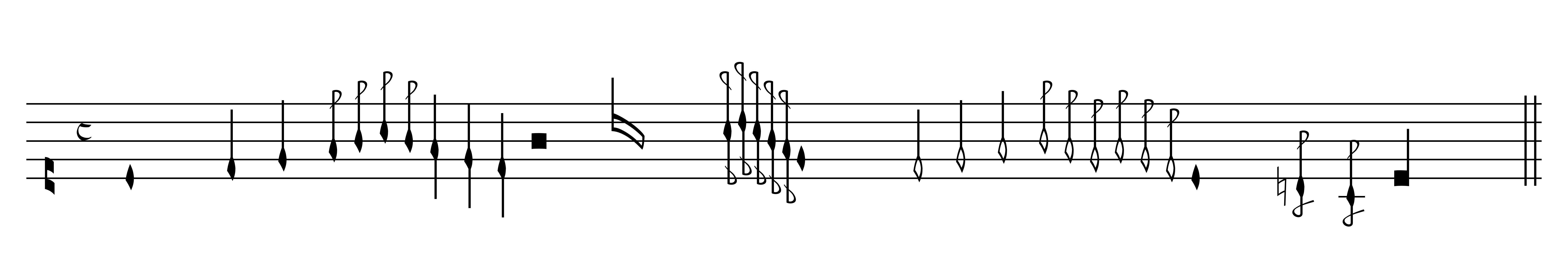
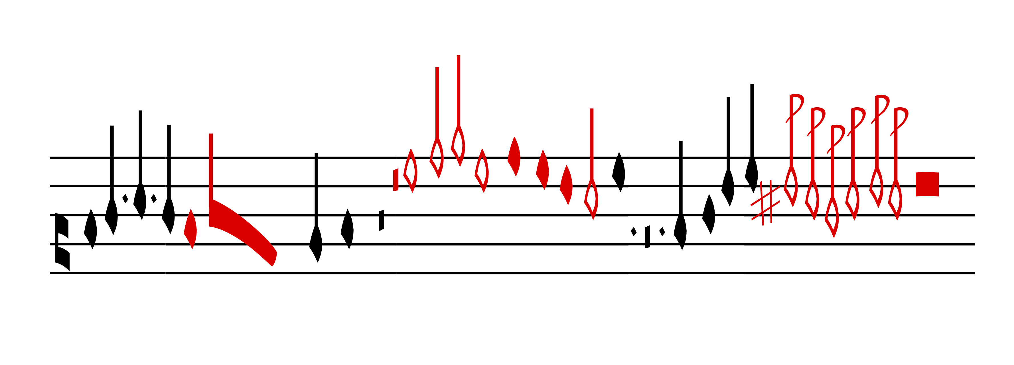
Subtilior was commissioned by Anne Stone and created in 2015. It is based primarily on the notation in ars subtilior manuscripts like ModA, and the Chantilly and Squarcialupi Codices. A very brief (nonsensical) sample created in Finale can be seen here. Because of the complexity, however, Finale users will need to turn off stems in staff attributes, and use tuplets and the notehead tool to achieve and align the characters needed. It is also possible to use Subtilior in InDesign or other page layout programs in order to allow the use of red notation, which occurs frequently in this repertoire. A sample passage based on ModA (Modena, Estense MS Alpha M.5.24, fol. 11v.) and created using Subtilior in InDesign can be seen here. |
 |
|
|
|
|
Nivelle was created in 2011, based primarily on the notation in the Loire Valley chansonnier Nivelle de la Chaussée (ca. 1470, according to the recent re-dating by Jane Alden), now in the Bibliothèque Nationale. It is intended for use in early- to mid-15th-century music. All of the symbols come from Nivelle, although the sign of congruence and the sharp are not in the original layer (and the natural is made up from the sharp symbol). Nivelle can also be used for black notation, though at this point only in graphic layout. A sample black notation passage based on EscA (MS Escorial V.III.24) and created using Nivelle in InDesign can be seen here. A sample page using Nivelle in Finale (with a few addtional characters at the end) may be seen here. Note that the font was designed for upward stems only, but has a downstem feature if needed. |
 |
|
|
|
|
Florentius was commissioned by Bonnie Blackburn and Leofranc Holford-Strevens for their edition Florentius de Faxolis: Book on Music (Harvard, 2010), a late-fifteenth-century Italian treatise. It’s actually two fonts—Florentius and FlorentiusExtra, since the editors were using a PC, rather than a Mac, and couldn’t easily access the keys at option and option-shift characters. Like Squarcialupi, it was designed as a text font, though it is possible to create musical examples by placing the symbols on a staff |
 |
|
|
|
|
Chigi was created initially as a version of the 15th-century characters in Squarcialupi that was compatible with a music publishing program. Thus, the baselines, etc. are designed for use with a notation program and will require vertical adjustment if they are used in text discussions. The characters themselves are closely based on models in the famous Chigi Codex, a manuscript copied ca.1500 in one of the Brussels-Mechelen scriptoria and now in the Vatican Library. A sample music page using Chigi |
 |
|
|
|
|
Fossombrone was created as a print-style version of Chigi, being a white mensural notation font from the early 16th century, but using the early prints of Ottaviano Petrucci as a model. Petrucci was obviously unavailable as a font name. An early version of this font was named Odhecaton in honor of Petrucci’s first publication (Venice, 1501) and that was used for the incipits in the Amherst Early Music Quincentenary Edition of the Odhecaton, but I have made several additions and improvements since then and have called this later version Fossombrone to distinguish it from the earlier version. Fossombrone is the town where Petrucci settled and produced his later prints after leaving Venice. A sample music page using Fossombrone |
 |
|
|
|
|
Marenzio was commissioned in 2011 by Christine Jeanneret for the Marenzio Project in Rome, for use in creating the incipits for the madrigal editions. It uses characters primarily from the madrigal prints of Angelo Gardano, the most prolific of the famous French/Italian family of music printers, with supplements from other music publications of the late sixteenth century. |
 |
|
|
|
|
Morley was created in 2011 for use in the new edition of Morley’s Plaine and Easie Introduction to Practicall Musick, edited by Jessie Ann Owens and John Milsom. It uses characters entirely from that print, both in the musical examples and the anthology of pieces. A sample page using Morley may be seen here. |
 |
|
|
|
|
Ravenscroft was designed in order to render the music in an edition of Thomas Ravenscroft’s two music treatises (Ashgate, 2014), and includes both print and manuscript characters for that purpose. The print characters from his Briefe Discourse (1614) are similar to those in the English music publications of East and Snodham in the early 17th century. A sample music page using Ravenscroft |
 |
|
|
|
|
Parthenia was created based on the twoParthenia prints that were issued in England in the early 17th century. These are distinguished from most other music publications at that time by being engraved, rather than printed from movable type. the notational characters shown in those editions are thus done by hand, but by a professional artist, rather than a music copyist. To me, this is one of the most beautiful music fonts ever created. In fact, one user took the clef pictured at right and used it as a logo for his new series of publications—a practice I discourage but can understand from an artistic point of view. The font also includes a large selection of ornament signs used in 17th-century English music. A sample music page using Parthenia |
 |
|
|
|
|
Dendermonde was created originally for the use of Janet Youngdahl when she was a graduate student at CWRU, working on aspects of the notation of Hildegard von Bingen. Janet chose the specific characters to be represented in the font, and they are among the most beautiful in the two famous Hildegard manuscripts, the Dendermonde MS, and the Riesencodex, both of which have been published in color facsimile editions. Like any font based on neumes, where most of the notes are ligated together, there is no way to use Dendermonde as a substitute font in a notation program. The characters are to scale, however, so they can be placed graphically on a staff to create new editions, as well as used in discussions of Hildegard’s notation. |
 |
|
|
|
|
Phonetic is not a music notation font, but rather a font with the characters of the International Phonetic Alphabet (IPA). I have been working in historical pronunciations for more than two decades, and was always stumped in trying to render pronunciation descriptions for students. This font was created to fill that need. |
 |
|
For information on any of these fonts, please write to me at rwd@case.edu
For a Swedish translation by Weronika Pawlak, visit this address.
For a Turkish translation by Zoltan Solak, visit this address
|
|